Text in AI Images After GPT Image 2.5: When to Let the Model Write the Headline and When to Overlay It
For most of the history of AI image generation, “text in images” was a punchline. Signs read SLAE 50% OFT. Product labels dissolved into runes. Canva’s Magic Media, still the most-used generator by marketers by sheer footprint, scored 3 out of 10 on text rendering in one 2026 review and was described as “essentially unusable for any prompt requiring readable words.” The workaround everyone learned was to generate the picture and add the words in an editor.
GPT Image changed the first half of that. OpenAI’s models became the mainstream leader for readable text, and ChatGPT Images 2.5, released September 8, 2026, claims sharper letterforms, spacing, and alignment again, with launch-day reviewers reporting dense text and small labels rendering as real characters. Midjourney V8 closed much of its own gap in March.
Which means the question has quietly changed. It is no longer “can the model write the headline?” It is “should it?” For most marketing assets, the answer is still no, for reasons that have nothing to do with the model. This post is the decision guide.
What 2.5 can do with text, honestly
Short headlines, single labels, one language, one text element: reliable. Two or three separate text elements with different sizes: mostly reliable, with the occasional swapped word or drifted weight. Long copy, many elements, small type, non-Latin scripts: still risky. The pattern is consistent across every model we have tested and every published bake-off: accuracy falls as the amount of text and the number of distinct text objects rise, not as the text gets harder.
Two more details worth knowing before you trust it:
- The model chooses the typeface. You can describe one (“bold geometric sans,” “condensed serif”) and 2.5 follows the description better than any predecessor, but it will not use your actual brand font. Every baked-in headline is set in a font that is like yours.
- Text and layout are coupled. Change the headline and the model may recompose the image around the new word count. 2.5’s on-image comments make this much better than it was; they do not make the text a separate layer.
That is the capability. Now the constraints that decide whether to use it.
A real example: readable text we did not ask to render
On September 9, 2026, we sent the same accounting-software blog-thumbnail prompt to the September 8 snapshots of Flare and Sunburst. Both requests used medium quality, a 1088 × 608 PNG output, and no reference images. We generated one image per model, with no retries. The brief mentioned a two-day close instead of two weeks, but the image instruction explicitly said: “Do not render the logo, brand name or any typography inside the image.” These are generated test illustrations, not customer results.
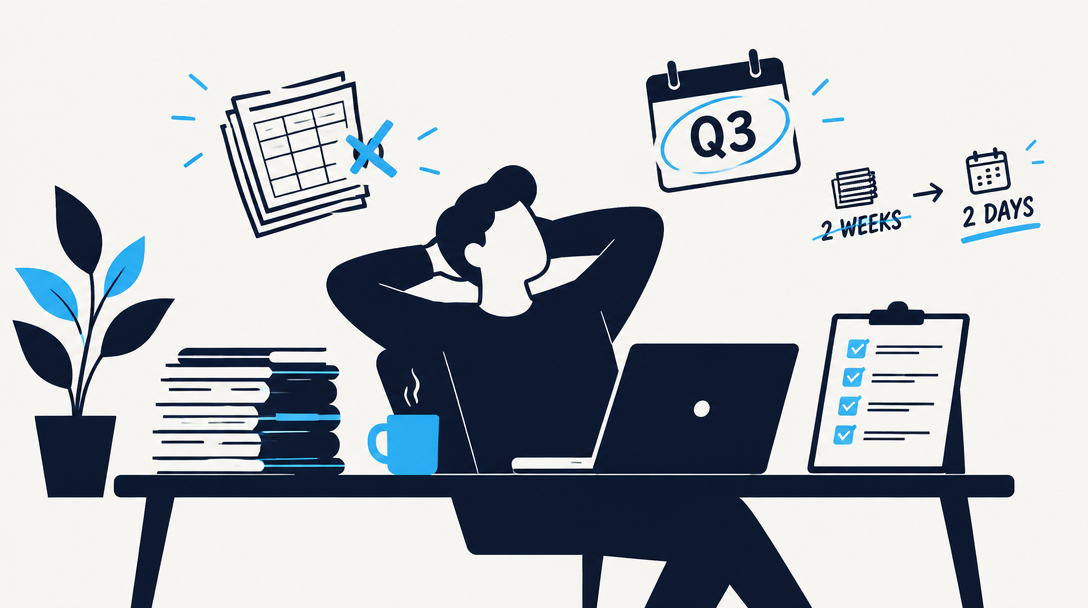
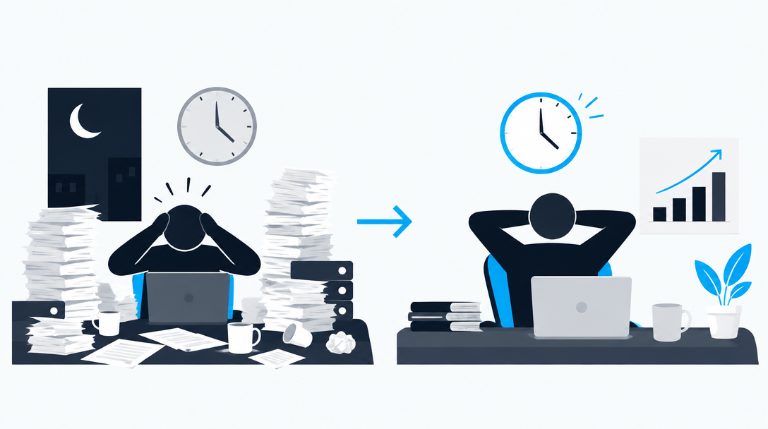
The issue here is not spelling: the words are readable. It is that copy from the brief became part of the pixels despite an instruction to keep it out. Check for unwanted text as well as misspellings before adding your headline as live text. This pair is a single instruction-following example, not the ten-prompt OCR test described below or proof that either model always behaves this way.
The five things baked-in text breaks
None of these are model problems. A pixel-perfect headline inside a PNG breaks all five just as badly as a mangled one.
1. Editing. The headline is pixels. Fixing a typo, changing a date, updating a price, or shortening a line means regenerating and hoping the rest of the image holds. Overlaid text is a click.
2. Email. Many email clients block images until the reader opts in, and a meaningful share of readers never do. A headline inside the hero image is invisible on first open. Image-heavy emails are also a spam-filter signal. The subject line, headline, and call to action must be live text; the image carries the scene. AI Images for Email Marketing goes through the sizes and the dark-mode traps.
3. Accessibility and search. Screen readers cannot read pixels. Neither can search engines, nor the AI assistants increasingly summarizing your pages. Text in an image needs to be duplicated in alt text and, on a page, in real HTML, which means you are maintaining two copies of every headline.
4. Localization. One image per language, regenerated from scratch, with the layout shifting to fit German. Overlaid text is one image and a string table.
5. Testing. You cannot A/B test the headline against the image if they are the same file. Overlay them and you can run “same image, two headlines” and “same headline, two images,” which is the only way to learn which one actually moved the number.
The rule in one line. If the words might ever need to change, be read by a machine, be translated, or be tested, they do not belong inside the image.
The decision by asset
| Asset | Text in the image? | Why |
|---|---|---|
| Email hero | No | Image blocking, spam signals, accessibility |
| Landing page hero | No | Search, screen readers, headline testing |
| Blog cover | No, or a title you will never change | Search engines read the page title, not the pixels |
| Social tile (feed) | Sometimes | Disposable, never translated, rarely edited; the platform may still penalize text-heavy ads |
| Ad creative | Rarely | Every platform’s text-in-image guidance still exists; variants need editable copy |
| Event poster or flyer mockup | Yes | The point is a finished composition; you will print it, not edit it |
| Merch preview | Yes | 2.5’s Merch template exists for exactly this |
| Product label or packaging concept | Yes, from a reference | The label must look like your label; the reference does that, not typing |
| Infographic, diagram | Yes, with a sketch | Structure is the value; GPT wins this category in every bake-off |
| Quote graphic | Either | Fine baked in for a one-off; overlay if it is a series in one style |
The right-hand column has a pattern: text goes in the image when the image is the final artifact and nobody will touch the words again. Text stays out when the image is a component of something with a lifecycle, which is nearly everything a campaign produces.
The ten-prompt OCR protocol
Whether you use ChatGPT, the API, or a tool that runs GPT Image for you, measure text accuracy once on your own briefs. Fifteen minutes, and you will stop guessing.
- Write ten prompts for real assets you make. Each includes one exact phrase in quotes, three to eight words, your actual style of headline (“Book your fall tune-up”, “Q4 pipeline review: what changed”).
- Generate each once. No cherry-picking, no regenerating.
- Score each image: exact (every letter and space correct), near (one character wrong), fail (anything else).
- Repeat with two text elements per image (headline plus a smaller line).
- Repeat once more with a phrase in any second language you publish in.
Read the result like this: ten of ten exact on single phrases and eight or more on two elements means the model is fine for disposable tiles and mockups. Anything lower, or any failure in round five, means overlay for everything that matters. Save the sheet and rerun it when the model version changes; GPT Image has shipped a new version roughly every five months.
The workflow that makes the question go away
The reason so many teams bake text into images is not preference. It is sequence. When the image is generated first, in a chat window, before the copy exists, the headline gets typed into the prompt because that is the only place it can live. The image comes back with words in it, and now the words are pixels forever.
Reverse the order and the problem disappears. Write the copy first: subject line, headline, body, call to action. Then generate the image for that copy, with the prompt describing the scene and the layout leaving room for the words, and the words placed as live text in the email, the post, or the page. Edit the headline on Tuesday, translate it in October, test two versions in November; the image never changes.
That order is how Marqeable’s content studio works by design: the copy is written and checked before any image is generated, the image is created inside the piece with the copy already known, and headlines stay as text in the email or page. When you do want words on the image itself, for a social tile or a poster, the built-in editor overlays them in your actual font, and the free image editor does the same for anything you generated elsewhere. We are in private beta with a small early cohort: get early access to see it on your own campaigns.
Frequently asked questions
Is GPT Image 2.5 the best model for text in images?
On published tests, GPT Image leads the mainstream models on readable text, and 2.5 claims to improve it. Nano Banana 2’s accuracy drops with longer or multiple text elements; Midjourney V8 improved a great deal but is not pixel-reliable for headlines. Our asset-by-asset comparison has the detail. None of that changes the overlay rule.
Can I get the model to use my brand font?
No. You can describe the font’s character and 2.5 will approximate it. For the actual font, overlay.
Does text in social images hurt reach?
Platform rules have relaxed since the old “20% text” days, but text-heavy creative still tends to underperform in ads, and platforms flag it. For organic tiles, a short headline is fine; for paid, keep the words in the ad copy fields.
What about text in a reference image?
Different case. If your product label is in a reference photo, 2.5’s reference fidelity is designed to keep it intact through scene changes. That is the model preserving your text, not inventing it, and it is the strongest argument for building a reference set.
The bottom line
GPT Image 2.5 took text rendering from a punchline to a capability, and for posters, merch, mockups, and infographics you should use it. For everything with a lifecycle, which is most of marketing, the headline still belongs outside the image: editable, readable by machines, translatable, testable. Run the ten-prompt test once so you know your model’s real accuracy, then fix the sequence. Write the words first, make the image for them, and keep them apart.
Marqeable runs your campaigns, answers every visitor, text, and email in seconds, and turns them into booked jobs and meetings - even at 9pm on a Saturday. We’re in private beta with a small early cohort. Get early access
